‘MOD’ LOGOTYPE
CLIENT: ULTRA-REALITY
YEAR: 2025
LOGOTYPE:
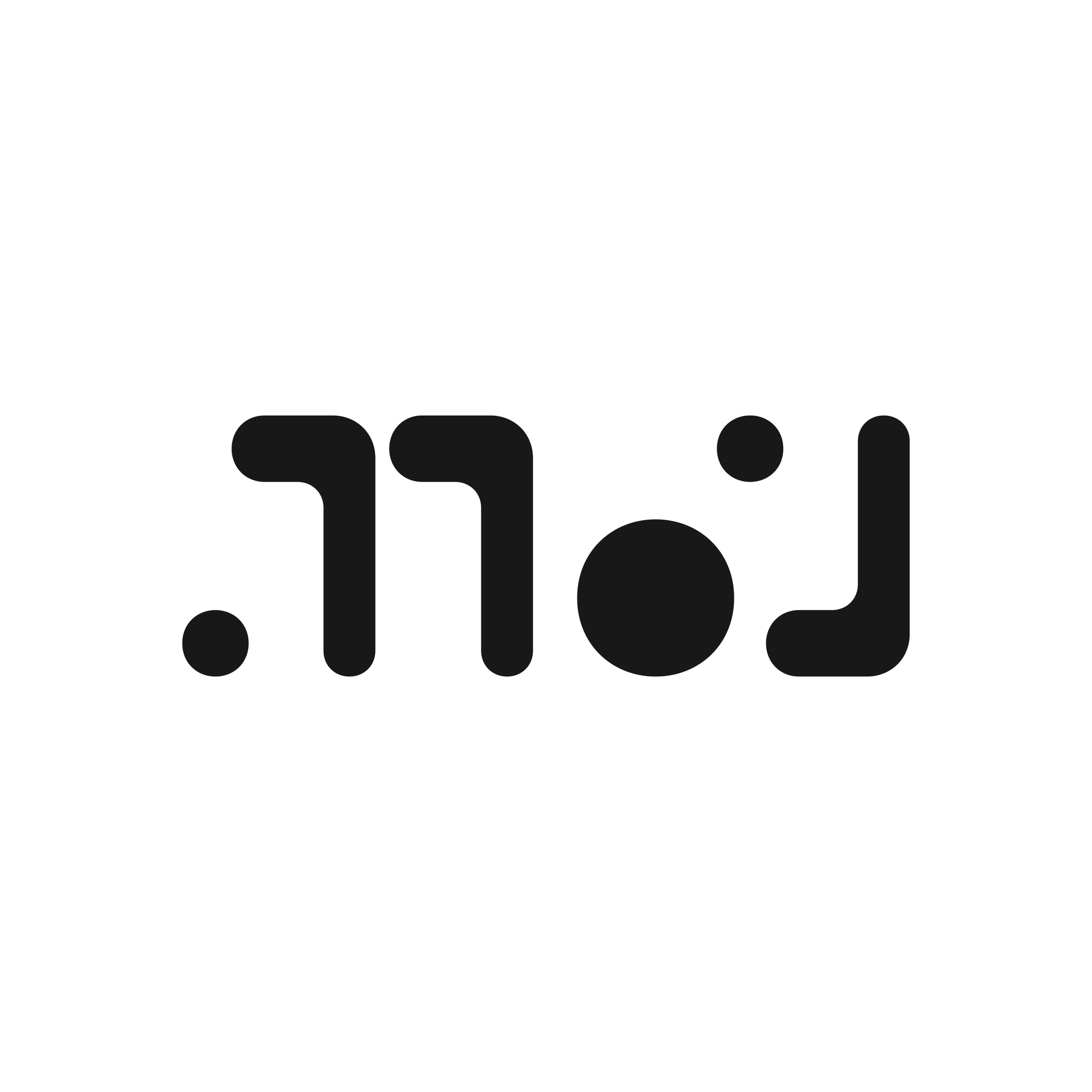
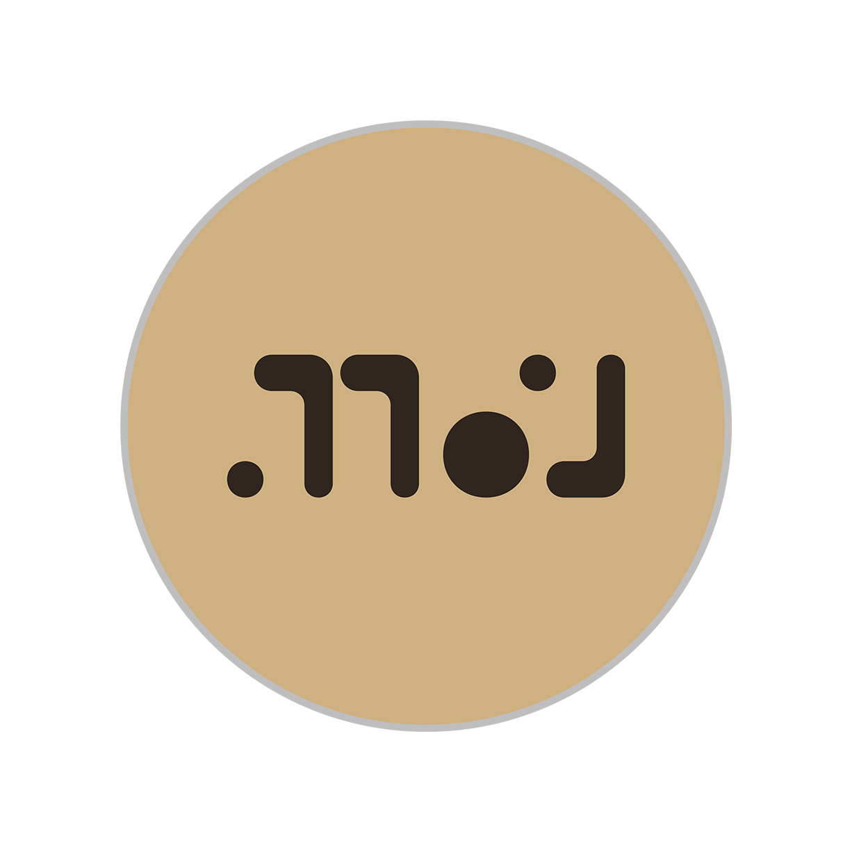
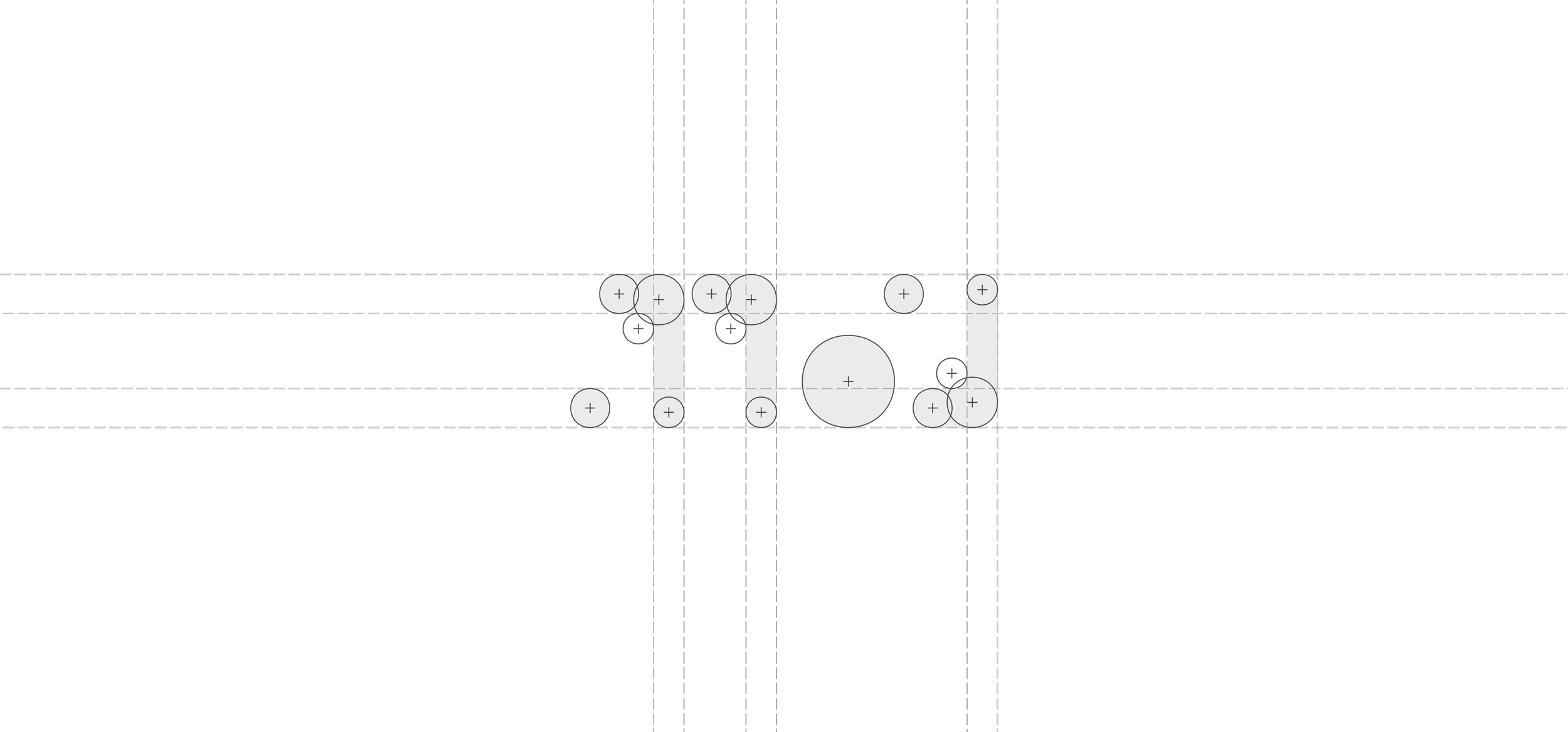
The Moderation Division is a faction of ULTRA-REALITY dedicated to the moderators who oversee its community. The logotype abstracts the word ‘MOD’ into a sequence of rounded geometric forms, breaking each letter down to its essential parts. The ‘M’ splits into a floating dot and twin arches, the ‘O’ becomes a solid circle, and the ‘D’ resolves into a dot and an inverted arch.
The logotype mirrors a community built on shared codes and insider fluency. The soft, uniform curves lend the mark an approachable, human warmth, balancing the authority of the division's role with the playfulness of the culture it protects.


DESCRIPTION:
Logotype reading ‘MOD’ in soft deconstructed forms. The ‘M’ appears as a small dot at the baseline followed by two arches. The ‘O’ is a solid circle. The ‘D’ is formed by a small dot at the top and an inverted arch. The letterforms are rounded and abstract, resembling a coded or hieroglyphic alphabet.
TYPEFACES:
Bespoke ‘MOD’ logotype by SPNSR.WORKS.
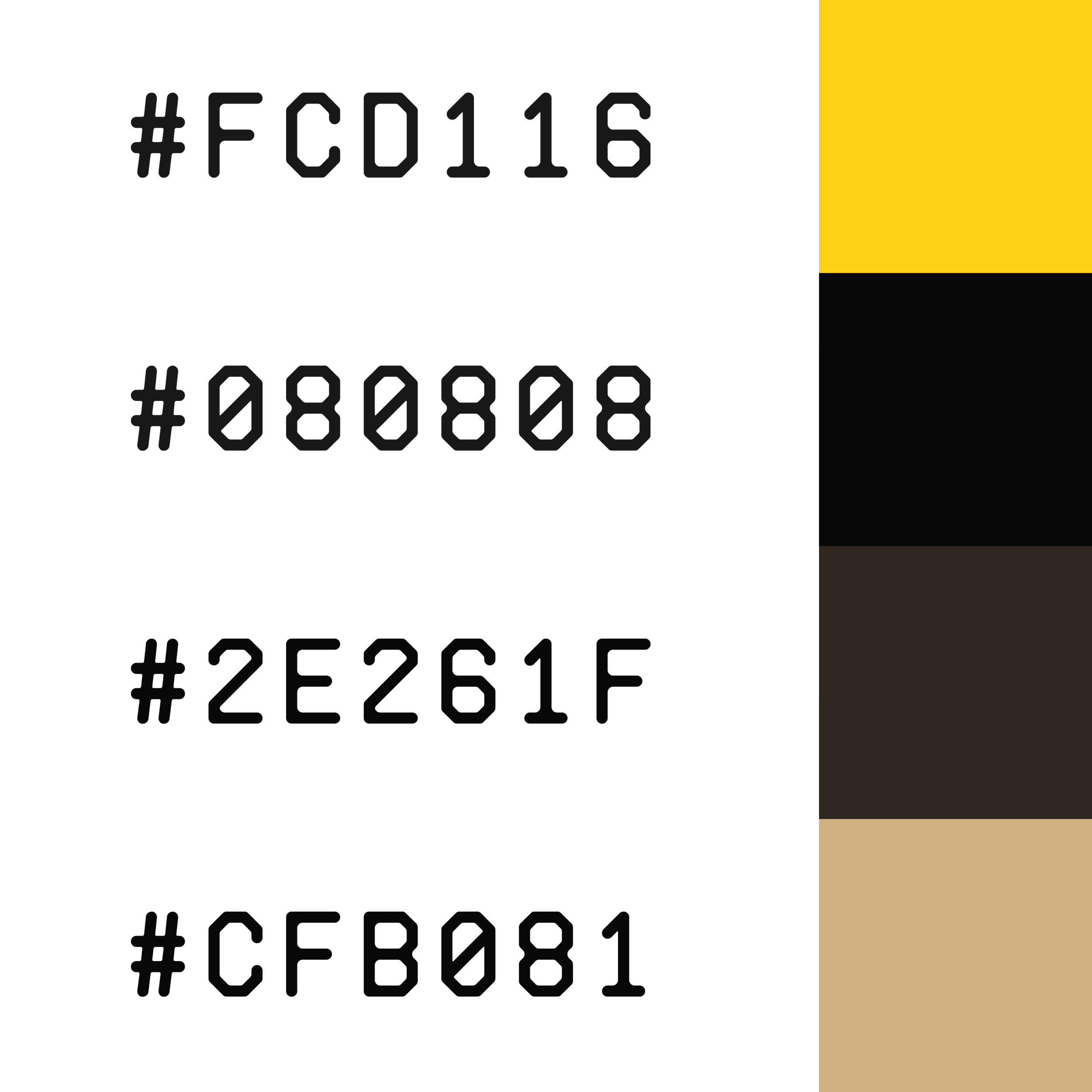
COLORS:
NOTES AND CITATIONS:
1.
n/a