‘NULL’ LOGOTYPE
CLIENT: NULL
YEAR: 2026
LOGO:
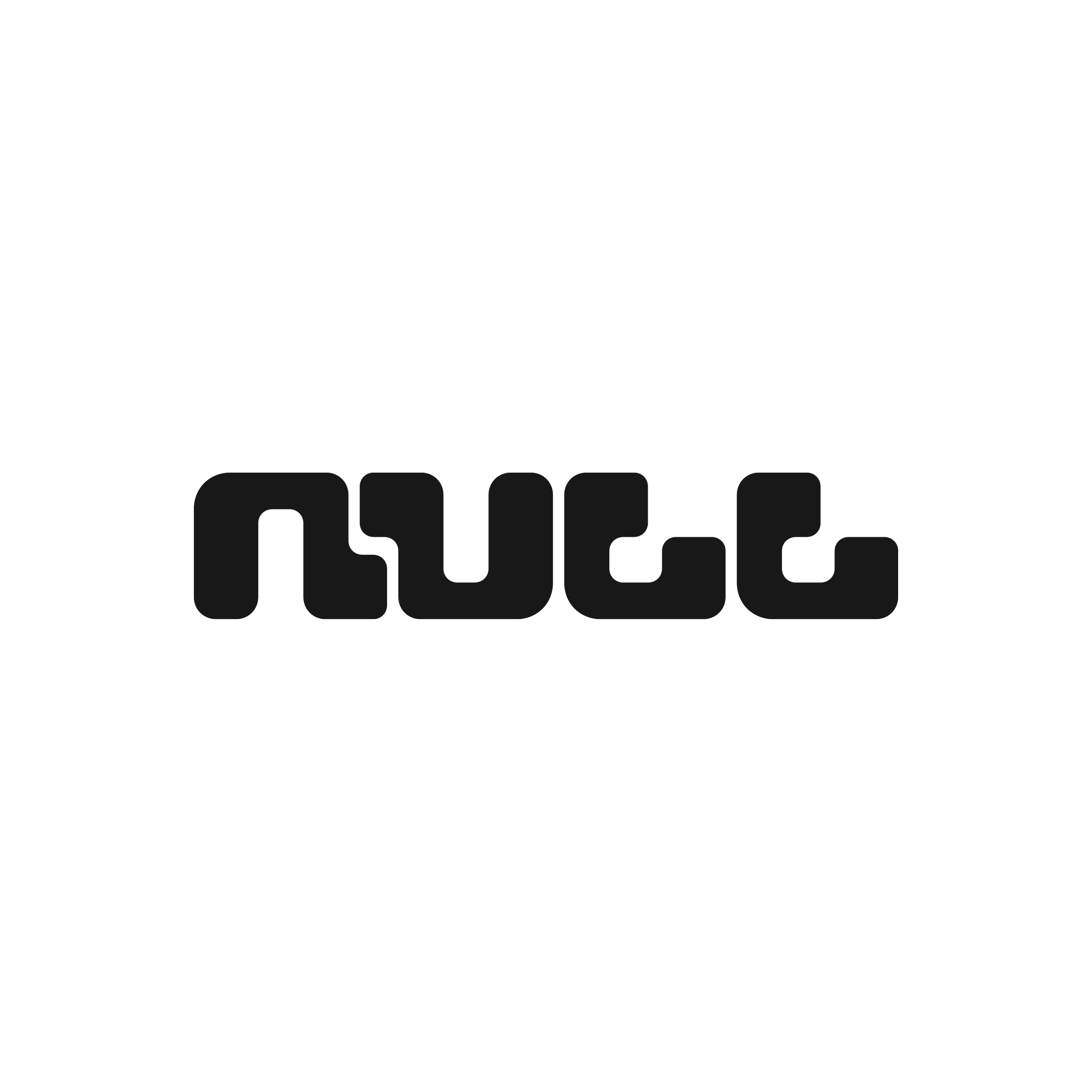
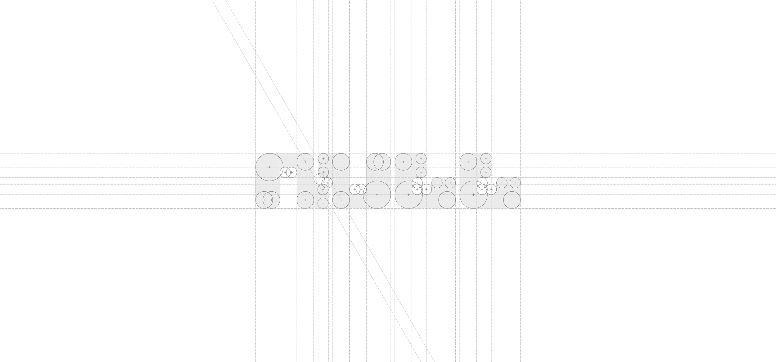
NULL is an experimental record label releasing music that exists only in limited digital runs. The logotype renders the name in dense, rounded letterforms that interlock like circuit traces. The construction plays on rotational symmetry, with the 'U' mirroring the 'N' flipped on its head.
The heavy forms give weight to a name that means emptiness, resulting in a mark that is dense, systematic, and paradoxical.
DESCRIPTION:
Logotype reading ‘NULL’ in dense, blocky, and softly rounded letterforms. The ‘U’ is the same form as the ‘N’ but inverted, the two of them interlocking at their stems.
TYPEFACES:
Bespoke ‘NULL’ logotype by SPNSR.WORKS.
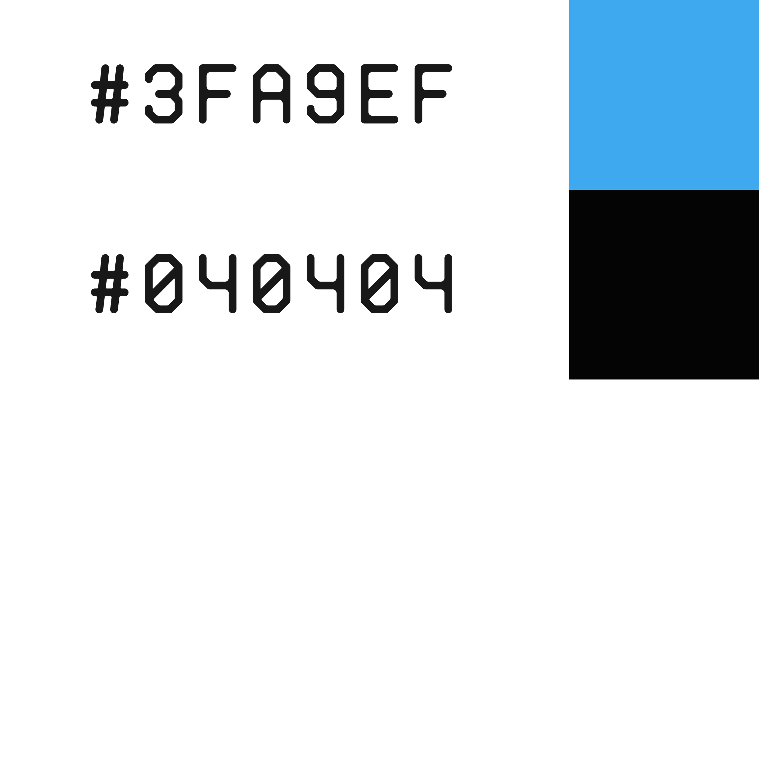
COLORS:
NOTES AND CITATIONS:
1.
n/a